How to build and iterate wireframes for modern app development

Moving forward in our web and mobile development introduction series, here we'll briefly walk through the process of building wireframes based on the UI Spec and UX Flow Chart we put together previously. Wireframe construction usually goes faster if the designer is the one doing the work, but regardless it should be a collaborative process with the entire founding team of your startup.
[Author's note: I wrote the first couple dozen tutorials in this series a few years ago and I'm in the process of updating the content to reflect the evolution of best practices in the industry. Please comment if you see anything I missed that should be updated. Thanks!]
Wireframing software
There is certainly no lack of wireframing tools available today, so go with whatever software the point-person is comfortable using. In our case for the wireframes shown below, Tim used Adobe Photoshop (one PSD file with multiple layers — exported to specific wireframe images as needed), which helped avoid unnecessary work duplication.
Linking to wireframes from the UX Flow Chart nodes
As the wireframes are constructed by the UI designer, we've found it extraordinarily helpful to always ensure the latest wireframe image URL (which we share in a Google Drive folder) is always linked to a node in the UX Flow Chart, like the “Profile” node in the example below:
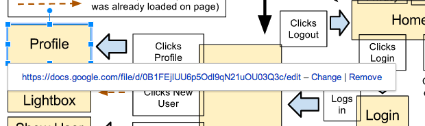
This way the team can login to the real-time updating UX Flow Chart (which, as we discussed in the last post, we use the “Drawing” software app in Google Docs) and always see the most recent wireframe version available for commenting.
Wireframe iterations
For this post we will show the very first draft of the wireframes produced by Tim (our UI designer) for the nodes in our UX Flow Chart and frame how we will iterate them to produce final versions before moving on to the mockups stage.
In general, the more thought-work you do here the better. There will always be a strong temptation for the product manager(s) to push off the work of thinking of the lower-level details at this stage, but this can be costly. It is almost always better to guide your designers — or at least sync up with them mentally — earlier than later.
Here is the Home node wireframe:
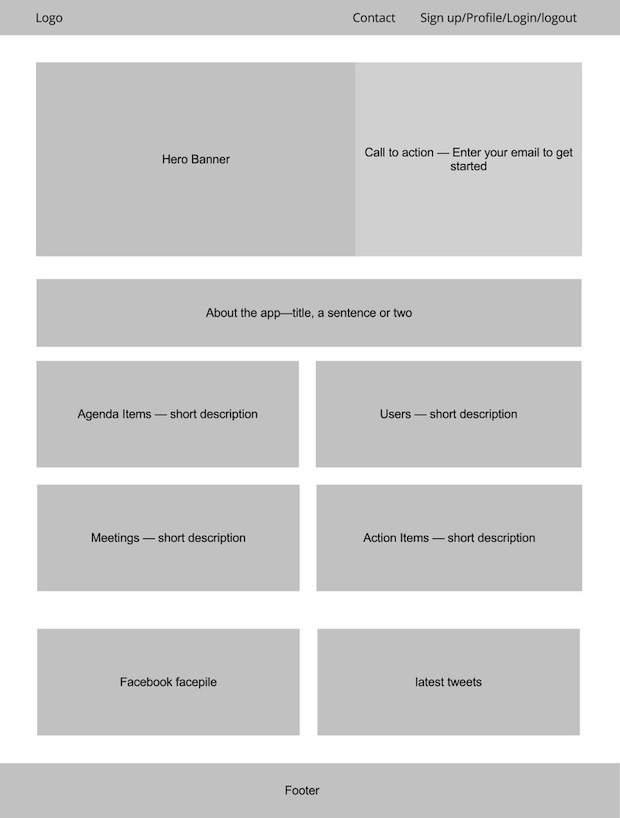
The name of the game here is for the team to come up with general layoutcomments/feedback/changes and not get confused with trying to make mockupchanges at this point.
For example, I'm not too worried about the position of the links in the top menu — as our designer will ensure it looks pretty in the mockup.
Also, the four rectangles corresponding to the four main resources our app will feature will each have an icon in there somewhere to make it look pretty — but we'll leave that level of detail for the mockup (but make sure we communicate it! Designers are usually pretty good at reading minds, but not perfect) :)
Moving on, here is the Signup Finalize node wireframe:
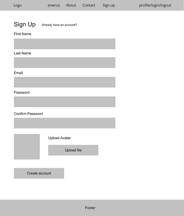
Again, the exact copy (i.e. text) and such can be modified later (they usually are anyway — so better not to over-think this detail here). The styles for the forms also cover our Login and Profile nodes, so while the designer should pump out those images for your team, we'll omit them here for the sake of brevity.
Also on this node, BTW, there will be a “flash notification” that appears for a few seconds (or permanently, depending on the desired UX), above the “SignUp” title. This is where we can tell the user something like “Thank you — please fill out these fields to complete your profile” or something like that.
Next, let's look at the Dashboard node wireframe:
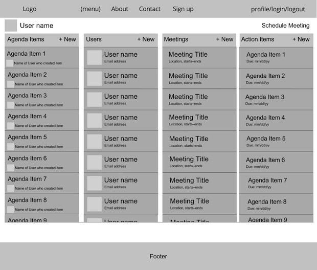
OK — a lot going on here but here are some thoughts about this first draft:
- Better to stick the current user's avatar in the top menu bar instead of on a second menu level.
- “Schedule Meeting” on the top-right there is redundant with the “+ New” in the meetings column, so it can be removed to reduce clutter (the columns would be then moved up a bit — but not too much — empty space is good).
- The default order of columns will be (1) Users, (2) Agenda Items, (3) Action Items, (4) Meetings — to go along with the suggested priorities (i.e. don't schedule a meeting unless you absolutely have to — the rest can be handled over email).
- The two key ideas an individual Agenda Item element needs to communicate are (1) the title, and (2) the one or more people who are assigned to it (in addition to the current user).
- A User element does not need to list the email address of the user — instead it can say something like “2 mutual Agenda Items” — but this is the kind of thing we can change later in the mockups and especially in the cutups (a.k.a. the HTML/CSS/JavaScript).
- The Action Item and Meeting elements look OK for now.
Other than these points, we'll need to ensure we have carefully thought through what the initial “tour” UI will look like when a user first comes to the Dashboard (i.e. the “Dashboard Welcome” node), but for now this general layout of the elements on our dashboard wireframe looks good.
Next we'll look at the Show Meeting Lightbox node wireframe:
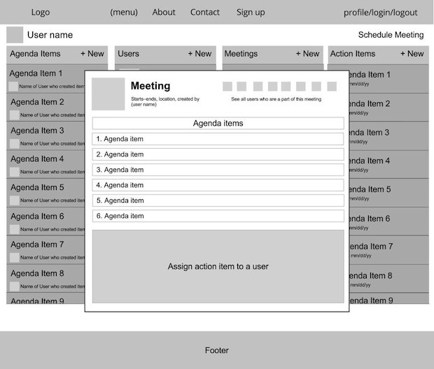
Ok — each of these four lightboxes (Meetings, Action Items, Agenda Items, and Users) that “show” a specific resource needs to have a clever way to show how it is (1) linked to the other three resource types, and (2) how those other resources can be easily previewed, edited, created, and/or navigated to.
Specifically for our Show Meeting node above, this will be the lightbox openbefore, during, and after a live meeting, so it needs to allow users to easily (1) view the Agenda Item list, (2) make notes on those Agenda Items, (3) quickly assign an Action Item to a user based on that linked Agenda Item.
You get the idea…
For the sake of brevity we won't go into all the wireframe nodes and iterations here for our example app. Rather, the point of this post was to introduce you tohow we go about the process of initially creating and iterating wireframes before we get into creating and iterating full-blown mockups.
For your own future app(s) someday you will go through this process — everyone does it slightly differently — so ideally you'll want to read as many posts/articles on the topic as possible before you get started.
- — -
For our next post in this series we will examine how specifically we transition from wireframes to building mockups. From there we'll get quickly into cutting up mockups into HTML/CSS/JavaScript and begin hooking up our app into Ruby on Rails and Backbone.js. Previous post: How to create a UX Flow Chart.
Startup Rocket
We help entrepreneurs ideate, validate, create, grow, and fund new ventures.
Based on decades of startup experience, our team has developed a comprehensive operations framework, a collaborative online tool, and a personalized coaching experience to help take your business to the next level.